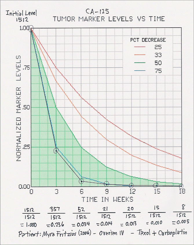
Filled-in Tumor Marker Series Graph
This graph shows an actual individual's tumor marker series curve while on chemotherapy.
Points plotted on the graph are normalized with respect to the initial cancer marker level, which in this case was 1512. The first normalized value to be plotted was 1512 / 1512 = 1.00. Subsequent values were also divided by 1512 to get their normalized equivalents.
For further info contact Robert Fritzius
Top